Study Together - Responsive Web Application

Project Overview
Study Together is a responsive web application designed to help students collaborate, stay accountable, and improve their academic success through shared study groups, messaging, and course-based communities. The goal of this UI case study was to create a clean, modern interface that supports clarity, quick interactions, and an uplifting, motivating study atmosphere.
The Problem
As part of my CareerFoundry UI Specialization program, I was given a brief describing the frustration students face when studying alone: difficulty finding compatible partners, no centralized place to join groups, and low motivation without accountability.
My challenge was to transform this brief into a responsive, student-friendly web experience that reduces friction, improves clarity, and supports collaboration on any device.
The Solution
I designed a responsive web app that helps students find compatible study partners, join or create study groups, and stay accountable across devices. The UI focuses on a calm, uncluttered visual style, clear information hierarchy, and simple flows for onboarding, browsing groups, viewing group details, and messaging, so students can quickly move from feeling overwhelmed and isolated to feeling supported, motivated, and organized.
My Role
I worked as both the UX Designer and UI Designer, responsible for wireframes, prototypes, animations, visual design, responsive mockups, and final UI handoff deliverables.
Timeframe
10 weeks (CareerFoundry UI Specialization Project)
Tools
Figma
Canva
Target Users
Since this was a UI-focused project, all users information came directly from the CareerFoundry project brief. The target users are students who want to connect with peers to stay motivated, exchange feedback, and collaborate more effectively.
Key characteristics from the brief:
Students juggling studies with work, family, or limited time.
Want support staying motivated, organized, and accountable
Looking for like-minded peers to discuss topics or collaborate on projects
Prefer simple, intuitive tools that work on any device
Often overwhelmed by studying alone and need quick, friction-free interaction


With the visual system defined, I applied these components to build the final responsive interface.

These final screens reflect the cohesive visual identity and seamless interactions that emerged through iterative design, testing, and refinement.

Thank You
Thanks so much for reviewing my Study Together project!
This case study represents my growth as a UI Designer, and I’m excited to continue building thoughtful, user-centered experiences.
Let’s connect!
Email: destineemilburn.design@gmail.com
Portfolio: destineemilburn.com
User Goals
Based on the CareerFoundry brief, students want to:
Stay motivated and accountable
Find like-minded peers to study or collaborate with
Get supporting materials and feedback on assignments
Improve their study habits and efficiency
Stay connected across devices whenever they have time
User Pain Points
Students often struggle with:
Feeling isolated or unmotivated when studying alone
Difficulty finding reliable or compatible study partners
No centralized place to join groups or share resources
Juggling work, school, and personal responsibilities
Tools that feel too complex, cluttered, or inconvenient
Why This Matters for UI
The CareerFoundry brief highlighted that students often feel isolated, overwhelmed, and unmotivated when studying alone. They need tools that help them connect quickly, stay organized, and feel supported across devices. Because this was a UI-focused project, these insights directly shaped all visual and interaction decisions.
To support these needs, the UI had to:
Feel calm, clean, and uncluttered, reducing cognitive load for already overwhelmed students.
Use clear hierarchy so students can quickly browse groups, view details, and message peers without confusion.
Support cross-device consistency, making it easy to jump from mobile to desktop.
Provide an uplifting, motivating atmosphere through color, spacing, and friendly visual language.
Keep interactions simple and fast, minimizing friction during onboarding, browsing, and messaging.
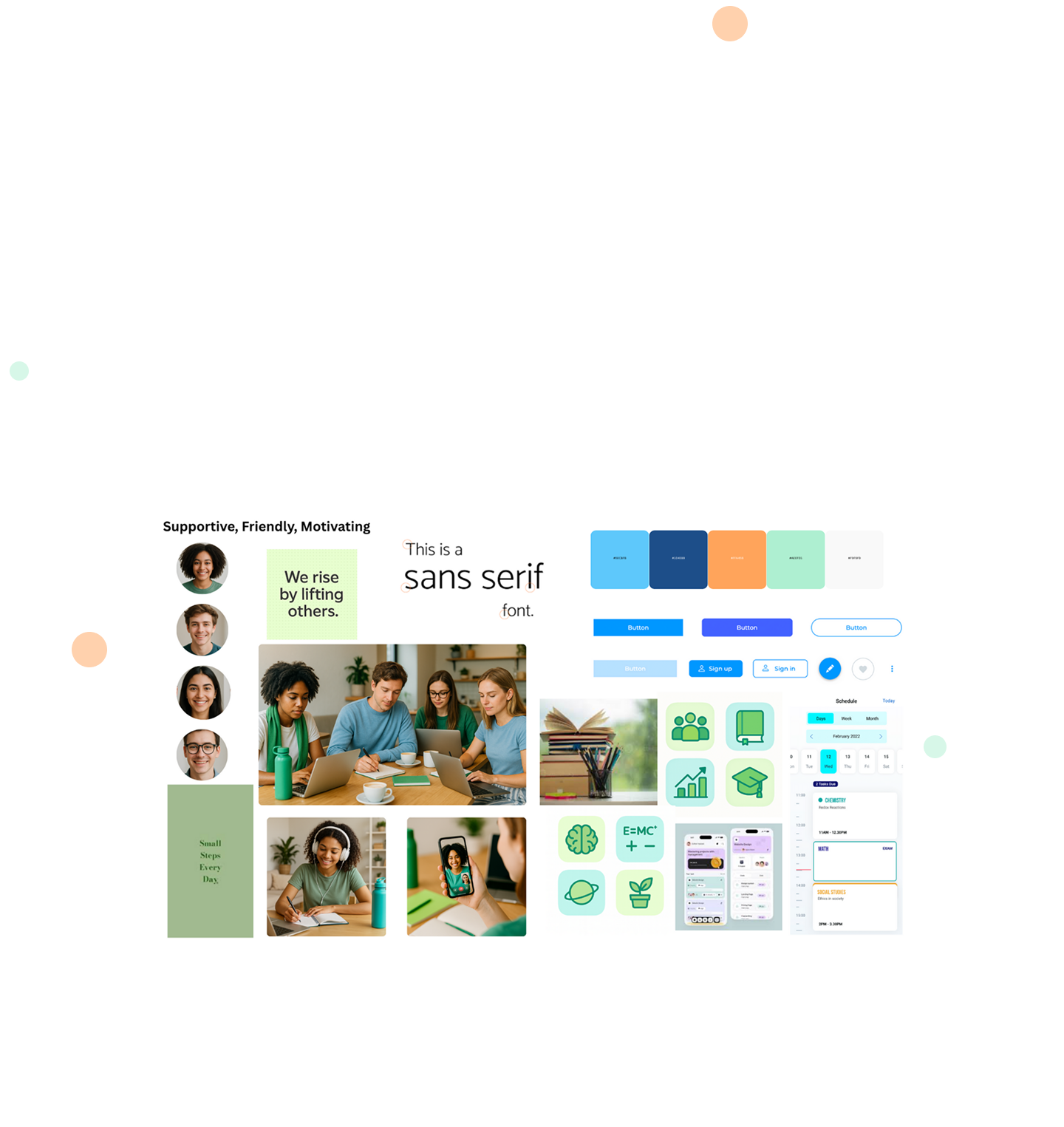
Mood Board & Visual Direction
The visual direction for Study Together was inspired by the brief’s emphasis on creating a friendly, welcoming, and motivating learning environment. To reflect these goals, the mood board focuses on calm colors, open spacing, and an uplifting tone that reduces stress for overwhelmed students.
The mood board highlights three key attributes:
Friendly & Approachable - soft color palettes, rounded shapes, and gentle gradients
Organized & Clear - clean layouts, structured spacing, and simple visual hierarchy
Motivating & Supportive - energetic accent colors and warm, encouraging imagery
These qualities guided decisions such as the dominant blue tones for calmness, the use of rounded corners for approachability, and the bright accent colors for moments of motivation and clarity.
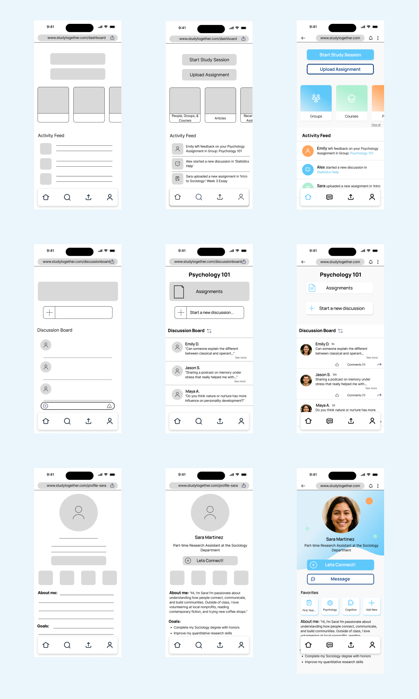
Wireframes
To begin the visual design process, I created low-fidelity wireframes using a mobile-first approach, ensuring the core user flows were simple, intuitive, and structured around primary app tasks like browsing groups, messages, and reviewing coursework.
The mid-fidelity wireframes refined hierarchy, spacing, and interaction patterns while maintaining visual clarity and reducing cognitive load.
As the layout solidified, these mobile structures became the foundation for the later tablet and desktop responsive adaptations, shown in the final design section.
These wireframes also served as the foundation for tablet and desktop layouts using a responsive grid system.
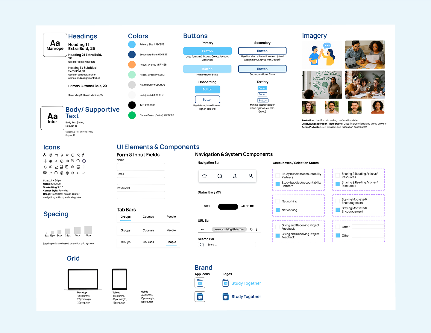
Style Guide
The Study Together Style Guide establishes the visual language used across the responsive web application. It documents the key elements that ensure consistency across screens, breakpoints, and interactions. This includes color, typography, buttons, spacing, grid, icons, imagery, and UI components.
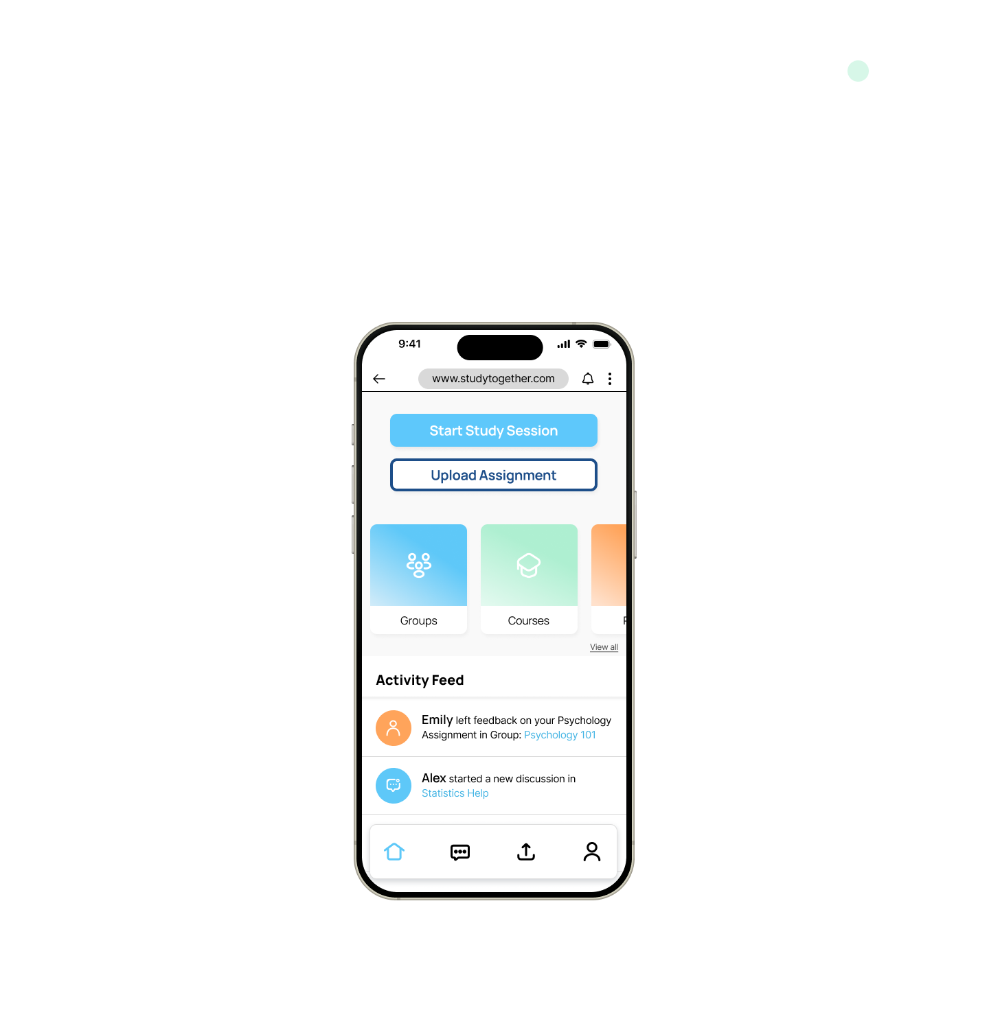
Prototype
This interactive prototype showcases the final responsive UI, key interactions, the main user flows — including groups, messaging, and course navigation. It brings together the complete visual system and demonstrates how the product functions across mobile, tablet, and desktop.
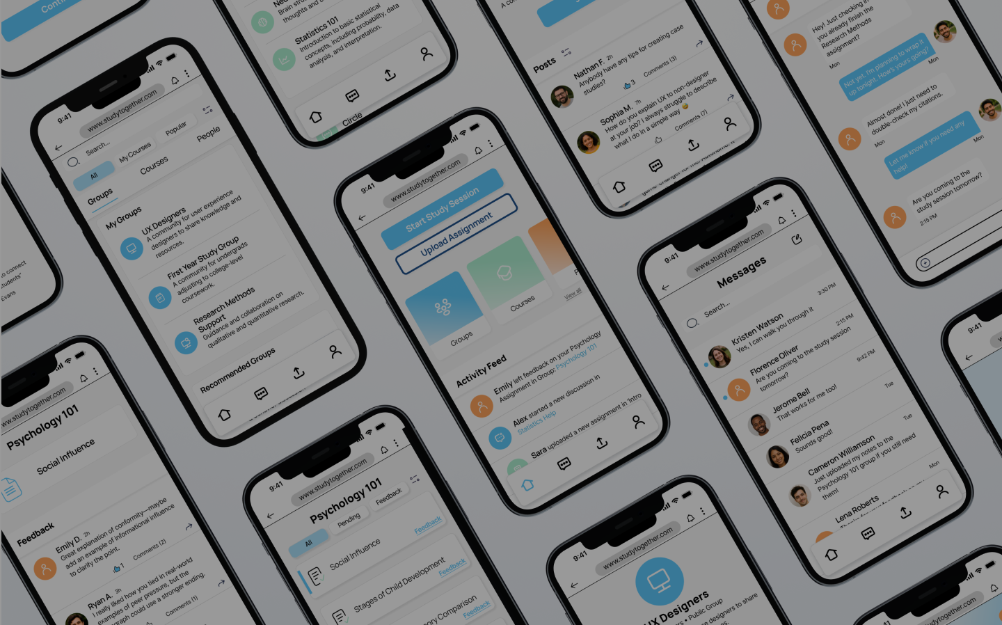
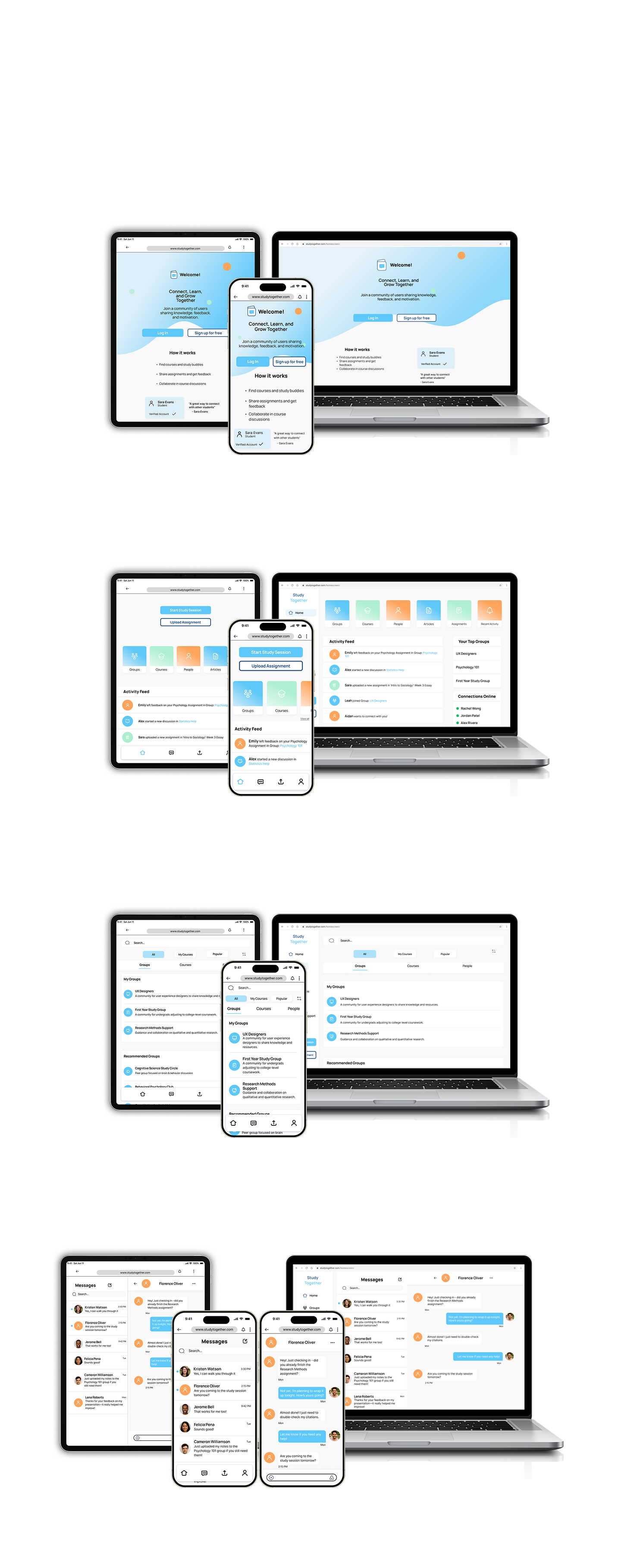
Final UI Screens
These final screens highlight the complete responsive UI for Study Together across mobile, tablet, and desktop. The design system prioritizes clarity, warmth, and ease of use, creating an experience that feels consistent and supportive no matter where students access it. Each screen reflects the refined components, interactions, and visual patterns developed throughout the project.
Landing Page
Dashboard & Activity Feed
My Groups & Discover
Messages & Message Thread
Learnings & Takeaways
Working on Study Together strengthened my confidence in creating clear, consistent, and responsive UI across multiple breakpoints. I learned how to refine components, spacing, and hierarchy so the design feels cohesive no matter the device.
This project reinforced the value of intentional visual decisions — typography, color, iconography, and grid structure all played a major role in shaping usability. I also became more comfortable documenting a full design system and translating it into polished high-fidelity screens and an interactive prototype.
Overall, this experience helped me grow as a UI designer and taught me how to balance aesthetics with clarity, accessibility, and user motivation.
Next Steps
Explore additional UI screens, such as a group detail view and notifications
Add micro-interactions to enhance the experience
Conduct usability testing to validate layout and hierarchy
Expand the responsive layout to wider desktop breakpoint